Friday, April 22, 2011

It is easier to build a child's future than repair a man's past.(revised)

(Please click on the image to see a larger version, Thank you!)
     
     
     Here is my sequential digital art composition pressing the issue of child abuse.  This assignment was a bit of a struggle for me and I really had to rack my brain to figure out the issue I wanted to express here.  It was very difficult to find photos once I did decide on child abuse but these are the four I found.  I believe it was so difficult to make an original design about this issue because there are so many designs about it.  I tried to make my design simple yet expressive and subtle yet empowering.  This was my final result.  I worked with four separate images and added the text as well as a glow to it.  I also faded out the little girl in the first photo and desaturated the first, second, and fourth photos as well as giving them a "true" black and white to add to composition throughout the images. In the last photo I added two images together working with masks to allow them to blend together in my images batter.  The rest, I think speaks for itself.  Thanks for viewing and as always any tips or comments are appreciated. 

Also I want to note child abuse is a very serious issue and should not be taken lightly.  For more information please refer to:  www.childhelp.org


The URLs for my images are as followed

http://www.flickr.com/photos/f_mafra/2394063213/sizes/o/in/photostream/

http://www.flickr.com/photos/fiskfisk/492917705/sizes/o/in/photostream/

http://www.flickr.com/photos/tasteful_tn/2496535398/sizes/o/in/photostream/

http://www.flickr.com/photos/barnabywasson/301538814/sizes/o/in/photostream/

Monday, April 11, 2011

Module 05: Digital Enhancements

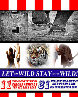
This is my first version of my Information circus poster.  
This is my revised version.  I had originally messed with the hue and saturation of the colors and had went with a pink and pastel blue with off white accents.  It looked nice but then I decided the colors did not match what the poster was saying.  So I stuck with the red, white, and blue.  I think they look better and are nice a bold; which was what I was trying to go for.  I also canned the middle photos and enlarged the photo of the elephants chained feet.  Another thing I did was change the font to upper and lower cases rather than just the upper case.  Overall I think this version looks a lot better.  It is amazing what a fresh look and a few small tweaks can  do to a design.  It doesn't change much but it makes such a difference. 

Revised Book cover

     Here is a revised version of my book cover.  I tried changing the text to white like you had suggested but it did not look right, pl;us it seemed to blend too much into the now on the bottom.  So instead I changed the text to red and then adjusted the "bevel and emboss" to give it a 3D effect and also changed up the opacity of the text on the cover.  I believe these changes allow for the text to pop out a bit more than before.  I also had to change the spine because of the changes on the cover.  I got rid of the apple as one classmate suggested and I went with a black spine instead.  Since the apple is now gone I needed something to fill that space so I added the "reader's circle" emblem because The Giver is one book recommended by this organization. Although not the feeling I was going for in the first design;  I am satisfied with this turnout as well.  

Friday, March 25, 2011

Module 04: Recreate a Book Cover- "The Giver"


      For my book cover redesign I choose one of my all time favorite books, The Giver by Lois Lowry.  I have never been much of a reader until recently.  I had read The Giver in high school and it story always seemed to stick with me.  I recently revisited this story a few months ago for my Children’s Literature class and fell in love with it all over again.  I seemed to understand it a lot more this time and it has now sparked a love of reading into me.  The original cover shows “The Giver” an old man whose extraordinary ability allows him to hold the memories of the world prior to their utopian community.  Previously “the Receiver” this man now little by little releases these memories to the new receiver; a twelve year old boy Jonas.  Jonas is a very unique young man that gets noticed by the elders of the community because of his wisdom, bravery, strength, and that little something special.  He begins to see the color red in his black and white community.  Once he is decided to become the new Giver, Jonas soon receives memories from the receiver.  His first memory, a pleasant one, is of sledding fast down a snowy hill, something neither Jonas nor anyone else has ever experienced in the community.  But even though this memory is delightful Jonas soon finds out that not all memories are so pleasant. 
     For this cover I wanted to attach a little more of the story onto the cover.  There is so much centered on the color of red, the snow, and cold.  I used three separate photos in total.  The sled is from Aunt Owee’s photo stream, the woods from johnmuk’s photostream, and the apple from Alberto_F’s photostream; all from www.flikr.com.  I started with the edge of the book and wanted to keep it relatively simple.  I knew I wanted to add the apple here; this is the first thing Jonas sees that changes.  I used the quick selection tool and outlined the apple and then refined my selection to make the edges fine and not to bold.  I then dragged it onto a white file and added a drop shadow with some noise to it to make it stand out.  I also added a tiny drop shadow to the lettering as well.  For the front cover I started with the sled and desaturated the image and then erased through the layer to allow the red to show.  I then refined its edges to add it to the image of the forest.  Meanwhile I changed my forest image into black and white, adjusting the colors to my liking.   Once this was done a dragged my sled onto the image of the forest adjusted it and transformed it to match size and position to the trees.  I also changed the opacity of this layer to give it a ghost or distant memory feel.   The lettering has drop shadows, although the authors shadow is a bit more spread out.  The title is larger but the opacity was changed as to blend with the image better.  


( I just want to note I think the border that my blog post has made around my image throws the image off a bit)

References:
      “Apple” Alberto_F.’s photostream.  Web 26 March 2011. http://www.flickr.com/photos/albertof/with/5503888740/
      Lowry, Lois.  The Giver.  Boston, Houghton Mifflin Company, 1993.  Print
     “sledding” Aunt Owwees’s photostream.  Web 26 March 2011.  http://www.flickr.com/photos/aunto/with/5257647716/
     Weinmann, Elaine, and Peter Lourekas. Photoshop CS5 for Windows and Macintosh. Berkeley: Peachpit Press, 2010.
“White Trees” johnmuk’s photostream.  Web 26 March 2011. http://www.flickr.com/photos/jm999uk/with/2391615273/

Saturday, March 12, 2011

Module 03: Poster


 BEFORE


AFTER 

For this poster used a total of four separate photos I found on www.flikr.com.  Two of these photos were used from Erik van Erne's “Ringling Beats Elephants” collection on flikr exposing the cruelty of the training process the Ringling Bros. company uses with their animals.  Animal’s trainers are often found using ropes, chains, whips, electric prods, and sharp hooks to “teach” these poor animals to do tricks for their shows.  The photo of the tiger, titles “Caged Beauty” was taken from Furyscaly's photo stream.  The top photo of the elephant in chains, titled “Chained Destiny…” was taken from an amazing blog photographer Ram Morrison’s collection on flikr. 


            I used these four photos to give the visualization of what these animals endure once in captivity.  Also by using different photos I was able to practice using many layers, masks, cropping, transforming, filters and ruler tools.  I started first with an easy transformation of the first photo, Chained Destiny (“Photoshop CS5 for Windows and Macintosh” p. 312).  For Caged Beauty, I was able to not only use sketch filters, but I also used the gradient tool and a layer mask to fade the edges (“Photoshop CS5 for Windows and Macintosh” p.244).  This was also done on the other two photos taken from the Ringling Beats Elephants collection.  I also used the refining selection tools for these two photos to drag-copy these images to the poster from their original location (“Photoshop CS5 for Windows and Macintosh” pp. 162-165 & pp. 238-239).  Throughout this poster I also made use of the smart guides, ruler guides, and grid (“Photoshop CS5 for Windows and Macintosh” p. 252). 
            As for the text I did use some transformations and many layers to keep the poster’s flow and balance.  I tried hard not to jumble too many words with the photos yet still tried to get the message I was trying to convey out there (“How to Understand and Use Design and Layout” p. 112).  Any information used in this poster was taken from the Born Free USA website, which is dedicated to the safety of animals in the United States.  

References:

    "49_S_Outdoor-training-area_sit-up-on-tub." Ringling Beats Elephants. Web. 12 Mar 2011. <http://www.flickr.com/photos/erik_van_erne/5026819316/>.

    "50_S_Outdoor-training-area_sit-up." Ringling Beats Elephants. Web. 12 Mar 2011. <http://www.flickr.com/photos/erik_van_erne/5026819974/#/photos/erik_van_erne/5026819974/in/set-72157625038338798/>.

    "Caged Beauty." Web. 12 Mar 2011. <http://www.flickr.com/photos/furryscalyman/291174023/sizes/z/in/photostream/>.

    "Chained Destiny...." Web. 12 Mar 2011. <http://www.flickr.com/photos/rammorrison/3438767892/>.

     Dabner, David.  How to Understand and Use Design and Layout.  Cincinnati: HOW Design Book, 2003.  Print.  

    "Ten fast Facts about Animals in the Circus." Born Free USA. Born Free USA, n.d. Web. 12 Mar 2011. <http://www.bornfreeusa.org/facts.php?more=1&p=431>.

     Weinmann, Elaine, and Peter Lourekas. Photoshop CS5 for Windows and Macintosh. Berkeley: Peachpit Press, 2010.

Friday, February 11, 2011

Propaganda Photomontage

I had originally started a different photo montage and spent a lot of time using layers and masks but then came upon the original photo of former President Mubarak yesterday on my Yahoo homepage.  I instantly thought of the old Uncle Sam poster and wanted to mix it up a bit.  For each image I first duplicated my background, as it is always a good idea to back up the original.  Too many times I have spent hours editing a picture just to mess up and have to start all over again but did not have the original to start with.  I also added an extra layer that I filled with an off white color to place below the image I was editing (this makes it easier to edit).  Then I used the "quick selection" tool to outline the objects in each picture.  I then used "refine edge" and a mask as displayed on page 163 or our Quickstart Guide to get all the edges.  After this I was able to make a new layer with only the selected image.  On a new file I started dragging and dropping the selected images.  Once this was done I transformed each image to fit to size.  I also did a little more transforming on the Uncle Sam hat to make it look a bit more like a mad hatter hat. I desaturated the image of Mubarak because I thought leaving it in color would distract from the message.  After all was said and done, i then merged all my visable files to make this image. 

Wednesday, February 2, 2011

My life as a Mom & Photographer!

With all this snow it is killing me that I do not get to take as many pictures as I do in the warmer weather.  So one day I had my boys dress up and took them outside for a little photo shoot.  I ended up taking about a hundred  photos between the two boys and it took about twenty minutes in all.  Not bad for a snowy afternoon!