BEFORE
AFTER
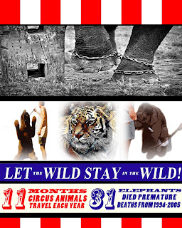
For this poster used a total of four separate photos I found on www.flikr.com. Two of these photos were used from Erik van Erne's “Ringling Beats Elephants” collection on flikr exposing the cruelty of the training process the Ringling Bros. company uses with their animals. Animal’s trainers are often found using ropes, chains, whips, electric prods, and sharp hooks to “teach” these poor animals to do tricks for their shows. The photo of the tiger, titles “Caged Beauty” was taken from Furyscaly's photo stream. The top photo of the elephant in chains, titled “Chained Destiny…” was taken from an amazing blog photographer Ram Morrison’s collection on flikr.
I used these four photos to give the visualization of what these animals endure once in captivity. Also by using different photos I was able to practice using many layers, masks, cropping, transforming, filters and ruler tools. I started first with an easy transformation of the first photo, Chained Destiny (“Photoshop CS5 for Windows and Macintosh” p. 312). For Caged Beauty, I was able to not only use sketch filters, but I also used the gradient tool and a layer mask to fade the edges (“Photoshop CS5 for Windows and Macintosh” p.244). This was also done on the other two photos taken from the Ringling Beats Elephants collection. I also used the refining selection tools for these two photos to drag-copy these images to the poster from their original location (“Photoshop CS5 for Windows and Macintosh” pp. 162-165 & pp. 238-239). Throughout this poster I also made use of the smart guides, ruler guides, and grid (“Photoshop CS5 for Windows and Macintosh” p. 252).
As for the text I did use some transformations and many layers to keep the poster’s flow and balance. I tried hard not to jumble too many words with the photos yet still tried to get the message I was trying to convey out there (“How to Understand and Use Design and Layout” p. 112). Any information used in this poster was taken from the Born Free USA website, which is dedicated to the safety of animals in the United States.
References:
"49_S_Outdoor-training-area_sit-up-on-tub." Ringling Beats Elephants. Web. 12 Mar 2011. <http://www.flickr.com/photos/erik_van_erne/5026819316/>.
"50_S_Outdoor-training-area_sit-up." Ringling Beats Elephants. Web. 12 Mar 2011. <http://www.flickr.com/photos/erik_van_erne/5026819974/#/photos/erik_van_erne/5026819974/in/set-72157625038338798/>.
"Caged Beauty." Web. 12 Mar 2011. <http://www.flickr.com/photos/furryscalyman/291174023/sizes/z/in/photostream/>.
"Chained Destiny...." Web. 12 Mar 2011. <http://www.flickr.com/photos/rammorrison/3438767892/>.
Dabner, David. How to Understand and Use Design and Layout. Cincinnati: HOW Design Book, 2003. Print.
"Ten fast Facts about Animals in the Circus." Born Free USA. Born Free USA, n.d. Web. 12 Mar 2011. <http://www.bornfreeusa.org/facts.php?more=1&p=431>.
Weinmann, Elaine, and Peter Lourekas. Photoshop CS5 for Windows and Macintosh. Berkeley: Peachpit Press, 2010.


I think this turned out really nice. It looks like an old fashioned circus poster that you would have seen during the twenties or thirties. It is really terrible what some circus’ do to their animals. I think the black and white is a nice contrast to the red and white stripes. I also like the three different affects that you used. I think the tiger looks really nice. I also like the font for the numbers, it is perfect. I know how hard it can be to find the perfect font. I have spent hours on some projects agonizing over fonts.
ReplyDeleteI like it. One thing I would change is the title "let the Wild stay in the Wild" is hard to read. It might be easier if the letters were all the same size and in upper and lower case. Not "in the".
ReplyDeleteAlso the tiger is not being brutalised if you can't find an image of a brutalised tiger leave it out. It dilutes your message
Fix for an A for the module.
Jon
I changed the Title but I decided to keep the tiger. Tigers are often the main attraction to a circus so adding it to a circus like poster just makes sense to me. I also think it ties the post together in the middle. Also I do believe he is being brutalized because he is behind a cage, like the title states "Let the Wild Stay Wild!"
ReplyDeleteI think its better. I like the head line more. I also like the circus feel. Jon
ReplyDelete